
JS-Plugin Dropdowntabs
HTML
JavaScript
CSS
Demo
<!DOCTYPE html>
<html>
<head>
	<title>Dropdowntabs</title>
	<link rel="stylesheet" type="text/css" href="ddtabs.css" media="screen" />
	<script src="ddtabs.js"></script>
	<script type="text/javascript" language="JavaScript">
		window.onload = function() {
			var tabgroup = new Dropdowntabs({openFlag:true,openTab:0,closeFlag:true});
		}
	</script>
</head>
<body>
	<div id="ddtabs">
		<div class="tabhead">Tabhead 1</div>
		<div class="tabcontent">
			<p>Text Tab 1</p>
		</div>
		<div class="tabhead">Tabhead 2</div>
		<div class="tabcontent">
			<p>Text Tab 2</p>
		</div>
		<div class="tabhead">Tabhead 3</div>
		<div class="tabcontent">
			<p>Text Tab 3</p>
		</div>
	</div>
</body>
</html>
/* RaWi-JS-Plugin:	Dropdown-Tabs (animierte Version)
	*	JS-File:					ddtabs.js
	*	CSS-File:				ddtabs.min.css
*/
(function() {
	// Constructor
	this.Dropdowntabs = function() {
		// Globale Plugin-Element-Referenz
		this.dropdowntabs = null;
		// Vars
		this.tabcontentArray = new Array();
		this.tabcontentheightArray = new Array();
		// Option-Defaults
		var defaults = {
			idTabs:			'ddtabs',					// ID-Dropdown-Tabs
			cHeadClosed:	'tabhead',					// Klasse Tab-Head geschlossen
			cHeadOpen:		'tabhead current',	// Klasse Tab-Head offen
			cTabcontent:	'tabcontent',			// Klasse Tab-Content-Div
			openFlag:		false,							// Flag zum öffnen eines Tabs beim Aufruf der Seite
			openTab:			0,									// Nummer des zu öffnenden Tabs (0 bis X)
			closeFlag:		true								// Offene Tabs schließen (true) oder offen lassen (false)
		}
		// Übernahme der Option-Defaults bzw. der Argumente der Seite
		if (arguments[0] && typeof arguments[0] === "object") {
			this.options = extendDefaults(defaults, arguments[0]);
		}
		// Dropdowntabs-Div
		this.dropdowntabs = document.getElementById(this.options.idTabs);
		// Array der Tab-Heads
		this.tabHeadArray = this.dropdowntabs.querySelectorAll('[class='+this.options.cHeadClosed+']');
		// EventListener zu den Tab-Heads hinzufügen
		for (var i = 0; i < this.tabHeadArray.length; i++) {
			this.tabHeadArray[i].addEventListener('click', this.handleClick.bind(this,i));
		}
		// Array der Tab-Content-Divs
		this.tabcontentArray = this.dropdowntabs.querySelectorAll('[class='+this.options.cTabcontent+']');
		// Höhe der Tab-Content-Divs ermitteln und dann auf Null stellen
		for (var i = 0; i < this.tabcontentArray.length; i++) {
			var rect = this.tabcontentArray[i].getBoundingClientRect();
			this.tabcontentheightArray[i] = rect.height;
			this.tabcontentArray[i].style.height = '0px';
		}
		// openFlag === true -> entsprechenden Tab öffnen
		if (this.options.openFlag === true) this.openTab(this.options.openTab);
	}
	// ---------------
	// Plugin-Methoden
	// ---------------
	// Tab öffnen
	Dropdowntabs.prototype.openTab = function(tabnumber) {
		this.tabHeadArray[tabnumber].className = this.options.cHeadOpen;
		this.tabcontentArray[tabnumber].style.height = this.tabcontentheightArray[tabnumber] + 'px';
	}
	// Tab schließen
	Dropdowntabs.prototype.closeTab = function(tabnumber) {
		this.tabHeadArray[tabnumber].className = this.options.cHeadClosed;
		this.tabcontentArray[tabnumber].style.height = '0px';
	}
	// Funktion handleClick
	Dropdowntabs.prototype.handleClick = function(tabnumber,event) {
		// Bereits offene Tabs schließen wenn closeFlag === true
		if (this.options.closeFlag === true) {
			for (var i = 0; i < this.tabHeadArray.length; i++) {
				// wenn ein anderer Tab offen, dann schließen
				if (this.tabHeadArray[i].className == this.options.cHeadOpen && tabnumber != i) {
					this.closeTab(i);
				}
			}
		}
		// Angeklickten Tab öffnen/schließen
		if (this.tabcontentArray[tabnumber].style.height == '0px') {
			// Tab ist geschlossen -> öffnen
			this.openTab(tabnumber);
		} else {
			// Tab ist offen -> schließen
			this.closeTab(tabnumber);
		}
	}
	// ------------------------------
	// Option defaults implementieren
	// ------------------------------
	function extendDefaults(source, properties) {
		var property;
		for (property in properties) {
			if (properties.hasOwnProperty(property)) {
				source[property] = properties[property];
			}
		}
		return source;
	}
}());
/* Styles Dropdowntabs */
.tabhead, .tabhead.current {
	background:#e0e0e0;
	font-weight:bold;
	color:#000;
	display:block;
	box-sizing:border-box;
	cursor:pointer;
	-webkit-transition:all .3s ease;
	-moz-transition:all .3s ease;
	-ms-transition:all .3s ease;
	-o-transition:all .3s ease;
	transition:all .3s ease;
}
.tabhead:after {
	content:'';
	position:relative;
	float:right;
	transform:rotate(-135deg);
}
.tabhead:hover { color:#fd8f00; }
.tabhead.current { color:#2472b9; }
.tabhead.current:after {
	content:'';
	position:relative;
	float:right;
	transform:rotate(45deg)
}
.tabhead.current:hover { color:#fd8f00; }
.tabcontent {
	display:block;
	overflow:hidden;
	-webkit-transition:height .3s ease;
	-moz-transition:height .3s ease;
	-ms-transition:height .3s ease;
	-o-transition:height .3s ease;
	transition:height .3s ease;
}
/* Values */
#ddtabs {
	width:75%;
	margin:45px auto 0px auto;
}
.tabhead, .tabhead.current {
	font-size:24px;
	margin:0;
	padding:14px 0px 16px 35px;
	-webkit-border-radius:10px;
	-moz-border-radius:10px;
	-o-border-radius:10px;
	border-radius:10px;
}
.tabhead:after {
	width:14px;
	height:14px;
	top:5px;
	right:35px;
	border-top:3px solid #777;
	border-left:3px solid #777;
}
.tabhead.current:after {
	width:14px;
	height:14px;
	top:12px;
	right:35px;
	border-top:3px solid #777;
	border-left:3px solid #777;
}
.tabcontent {
	width:95%;
	font-size:16px;
	margin:6px auto 20px auto;
}
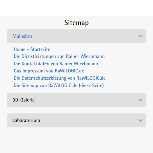
Dieses Plugin wird auf der Seite Sitemap verwendet.
Dieses Plugin kommt auf der Seite Sitemap zum Einsatz.
Sorry, aber die Darstellung der Codes dieses Beispiels ist auf kleinen Displays zu unübersichtlich.Sie können sich jedoch die Codes downloaden und das Plugin auf ihrem PC/Laptop/Tablet ausprobieren.